Brand Guide
0.0.1 — Last Updated 06:22 14/03/2026

Dirt Farm Logos
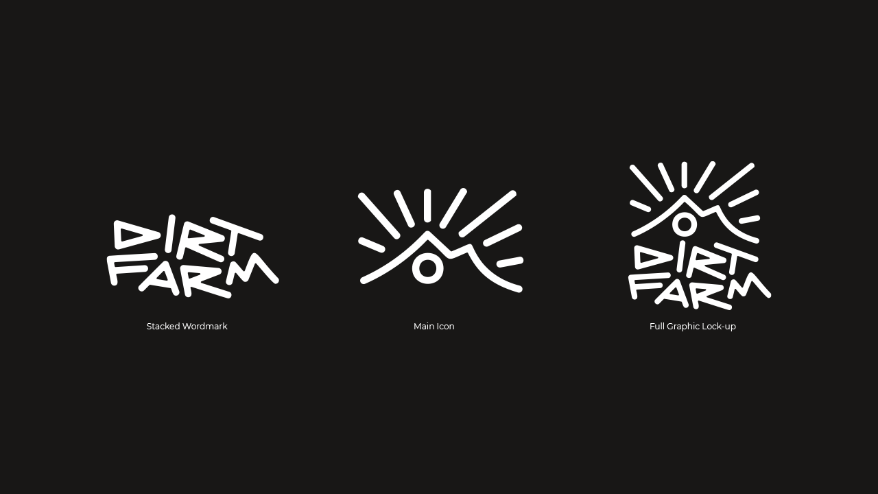
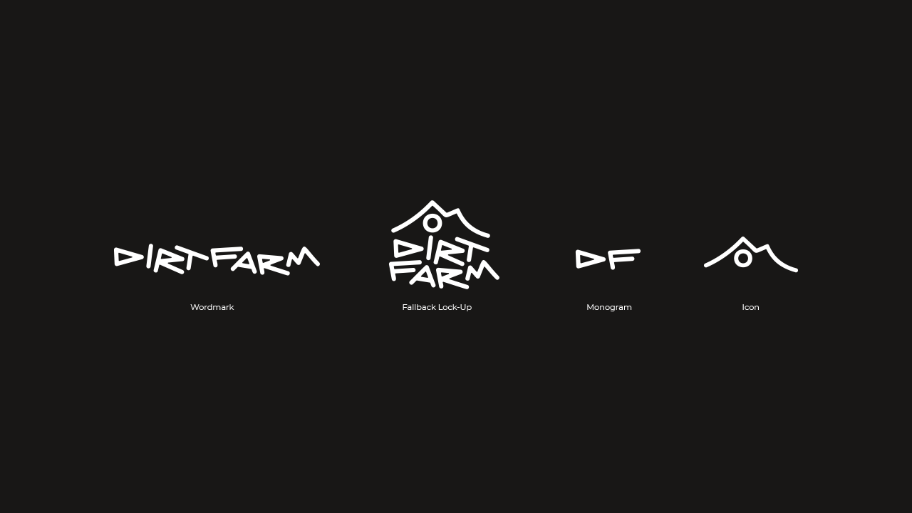
We have 7 variations of the logo. These are split into the main logos and then fallback logos. The variations give us flexibility with how we can apply the brand. Logo files can be found in the brand pack in downloads.
Main Logos
The main logos are the primary version of the logo to be used.

Stacked Wordmark
The main logo is the stacked wordmark. This is the most versatile logo and works in the most applications.
Main Icon
The main icon is the most symbolic logo. This represents The Skirrid and the feature jump in Full Moto. This is to be used when there is either context of dirt farm and we want to be more iconic or when we want to create intrigue to the brand.
Full Graphic Lock-Up
The Stacked Wordmark combine to make the full graphic lock-up. This is the be used when we want to create the most impact for the brand with the logo alone.
Fallback Logos
The fallback logos are variations of the main logos and to be used as a fallback when the main logo would not work.

Wordmark
The wordmark is to be used when the is low vertical height but large width, this works well in landscape situations such as banners.
Fallback Lock-Up
This version of the lock-up does not include the sun rays — this is where space may be limited but we still want to give more of an impact with the logo alone. Where possible the main icon should be used, as it follows similar dimensions unless it is important for the Dirt Farm text to be present.
Monogram
The monogram is only to be used as an ultimate fallback or where we want to use the logo as a graphic detail.
Icon
The icon does not include the sun rays. This is when we want to use the main icon but are limited due to space. It also gives us flexibility to use the space above where the rays are for more graphical elements.